Designing complex, system-driven products that people can actually use.
Interaction & UI design across hardware-connected interfaces, embedded displays, mobile-first apps and scalable design systems. Two in-depth case studies plus a personal project — click in to see the problem, the approach and the result.
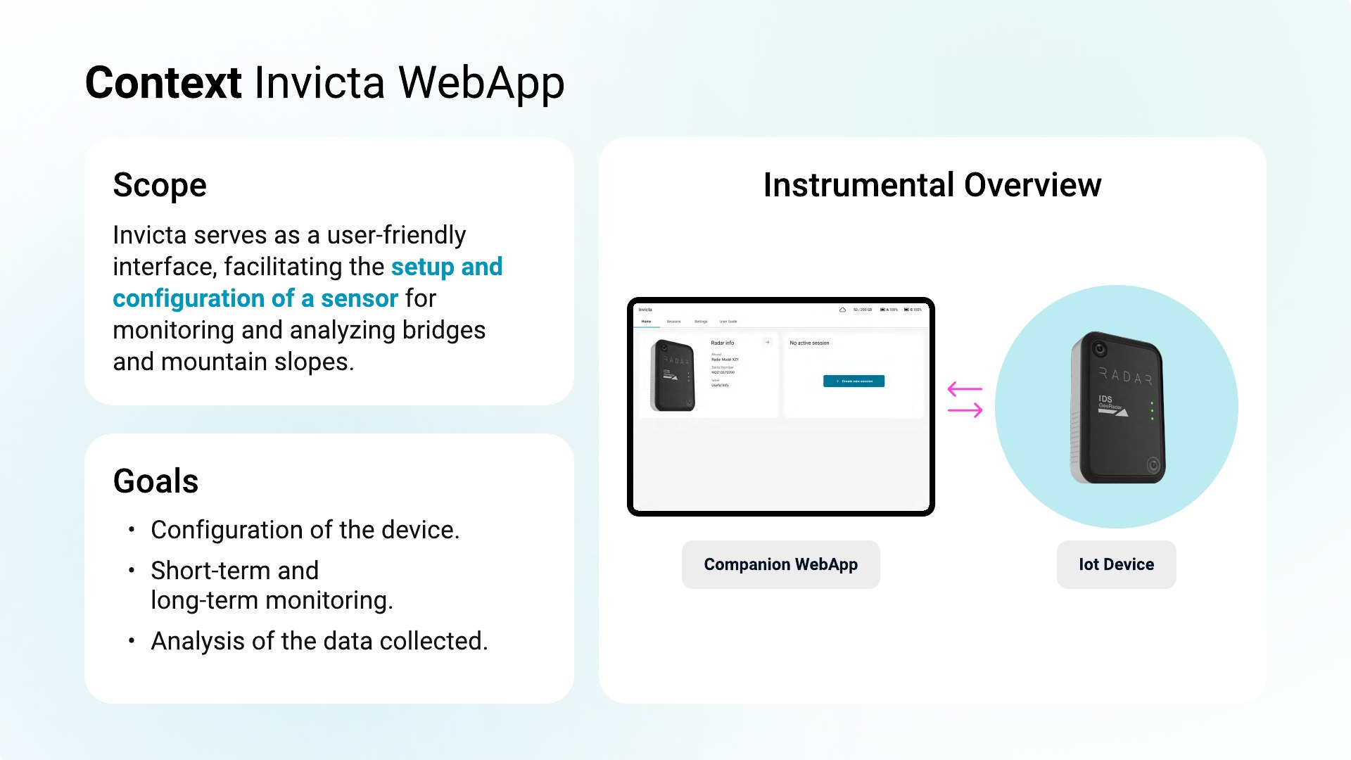
Invicta WebApp
Monitoring the structural health of bridges and slopes is safety-critical — but historically the preserve of specialists with complex tools. Invicta pairs a monitoring sensor with a companion web app so teams can set it up, watch movement over time and act on millimetre-level displacement before it becomes a risk. The challenge: make something this technical genuinely usable.
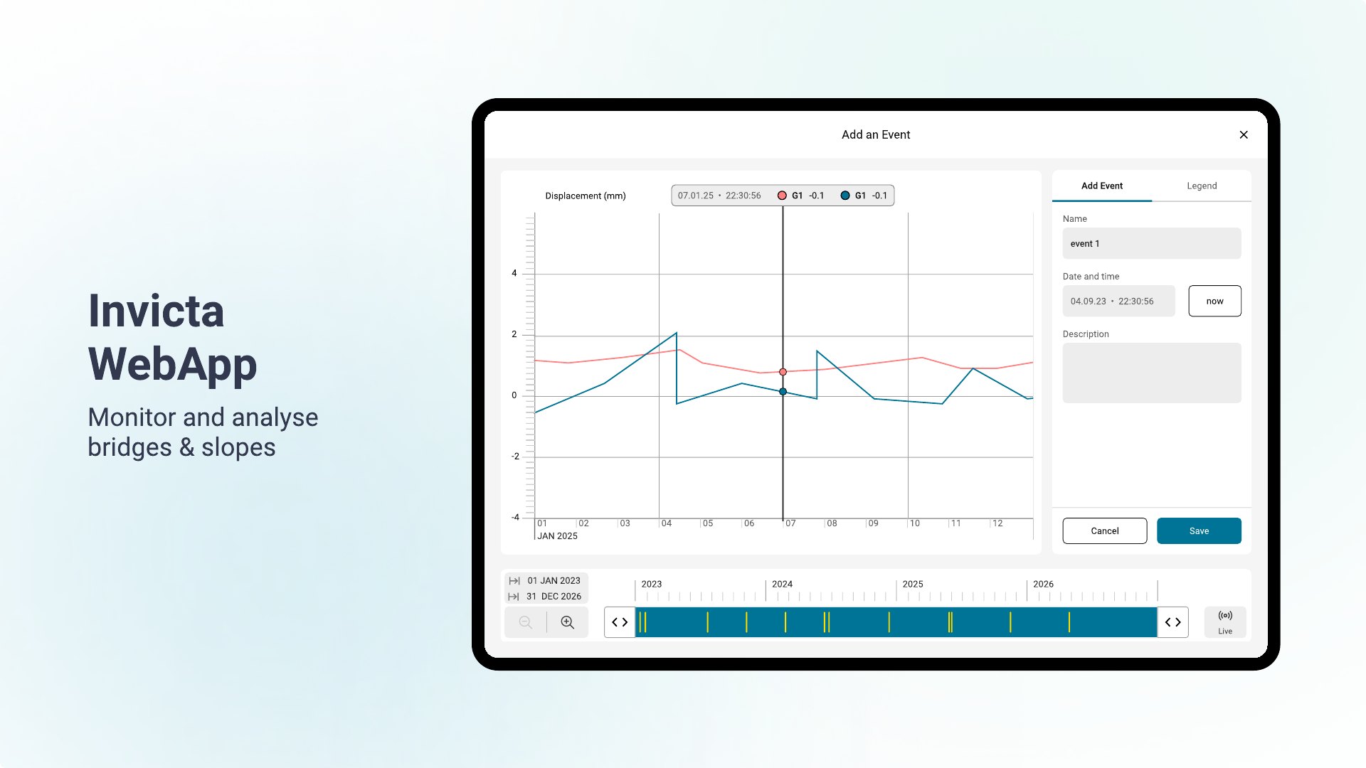
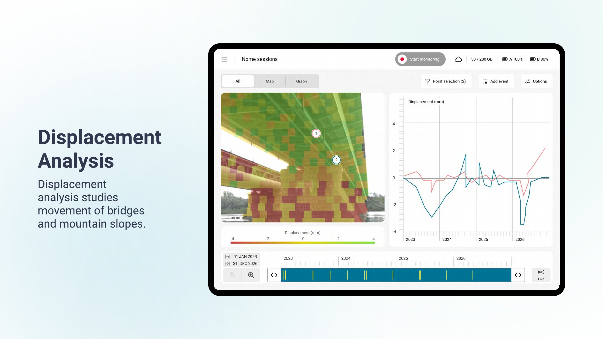
The interface for configuring the sensor and turning raw displacement, vibration and deflection data into something an engineer can read at a glance.
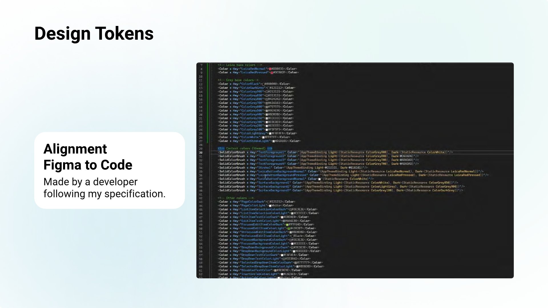
Sole UX/UI designer, reporting to the project manager and working directly with the front-end team to keep Figma and code aligned.
I joined early, when the first design lacked system alignment and a coherent IA. I rebuilt the foundations, then designed the complex components the system didn't yet cover.
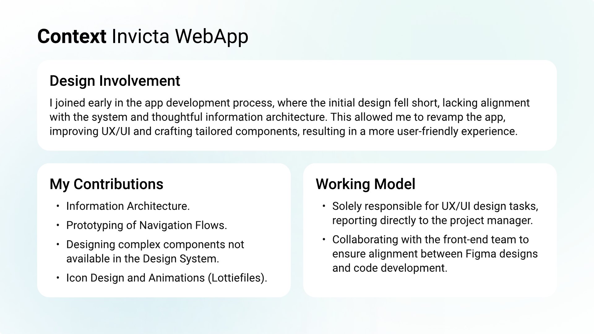
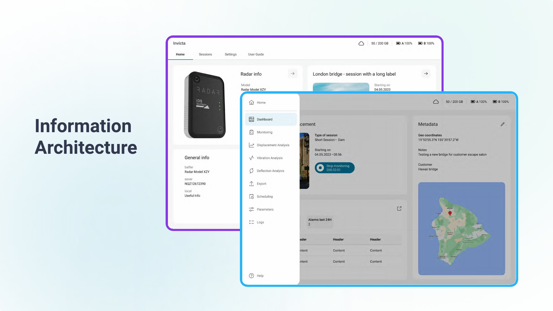
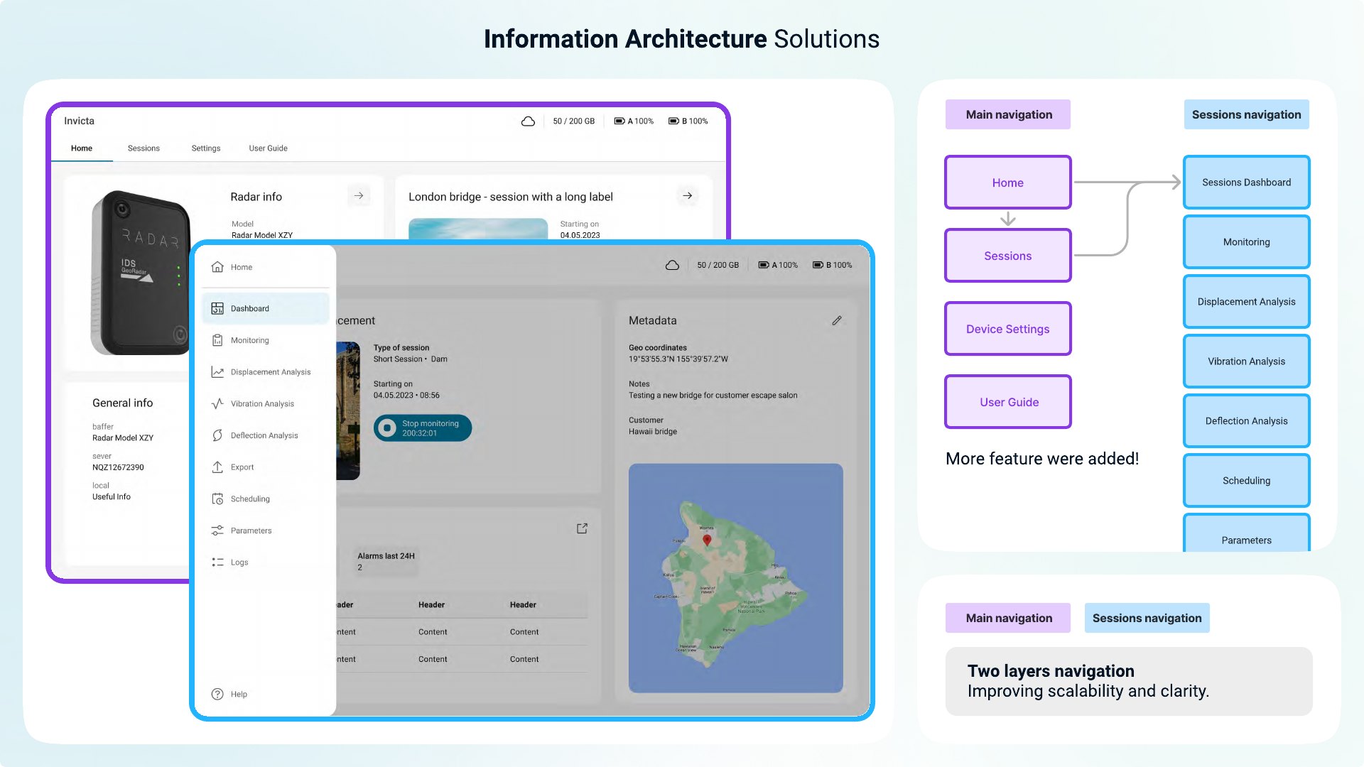
Information architecture
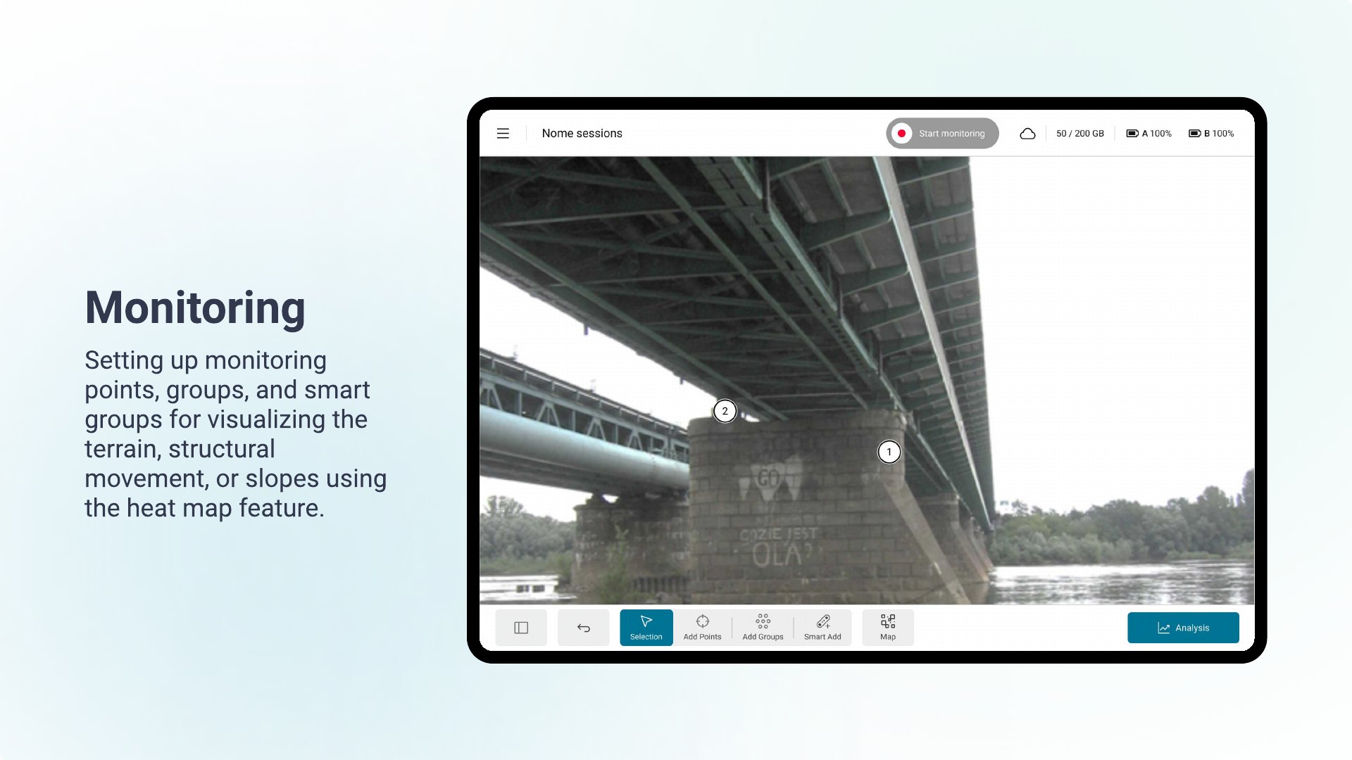
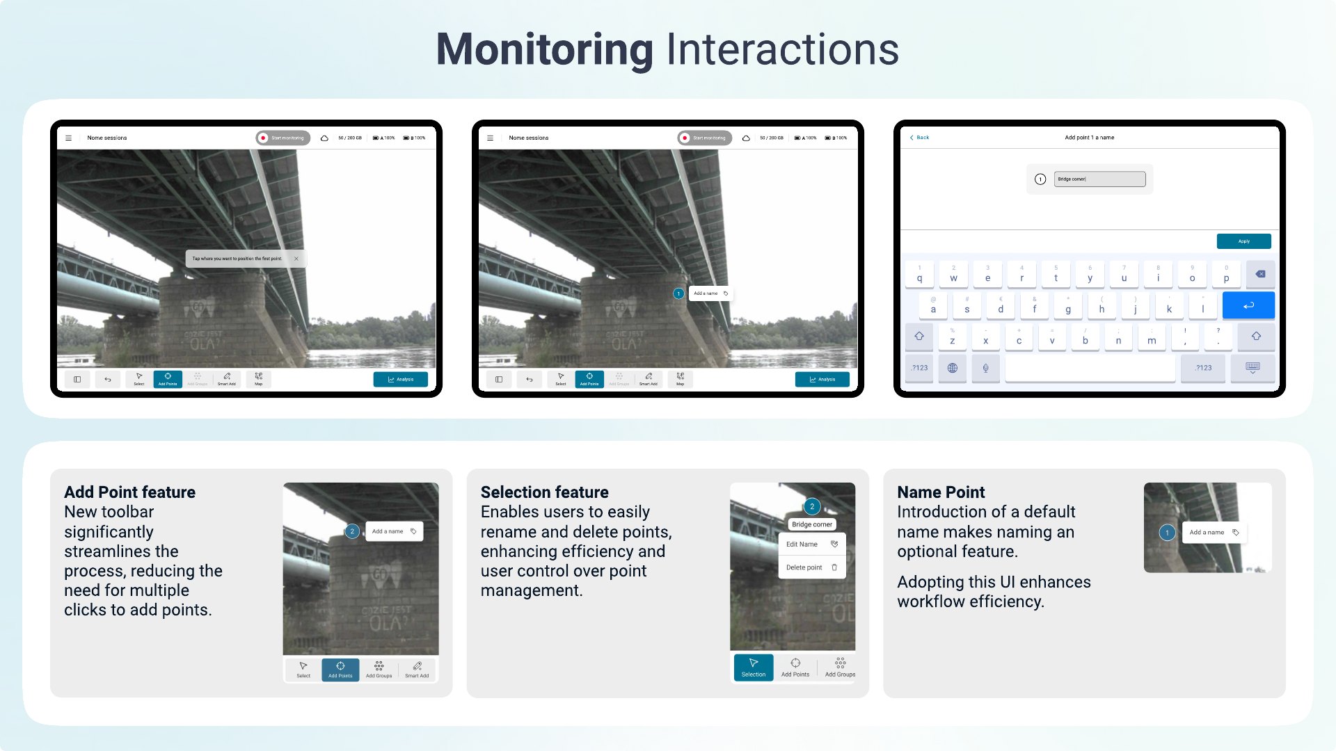
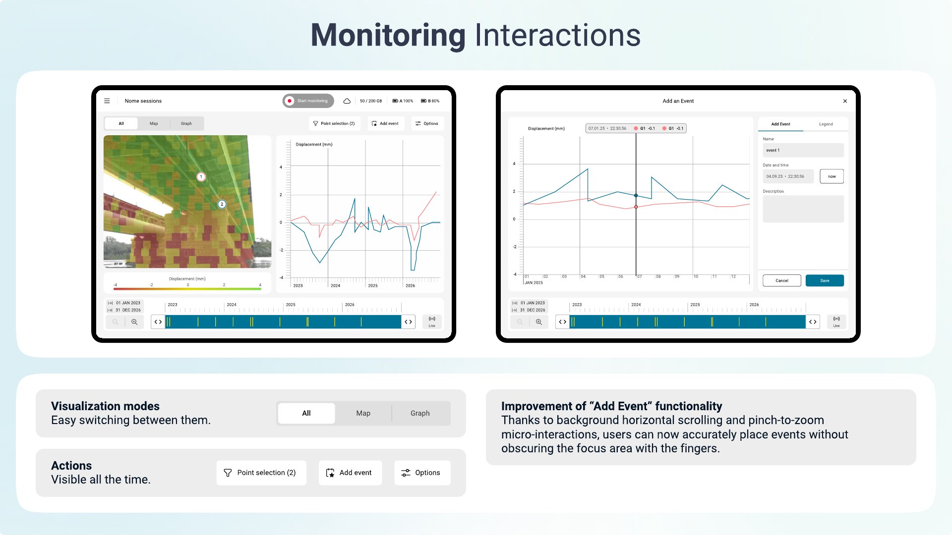
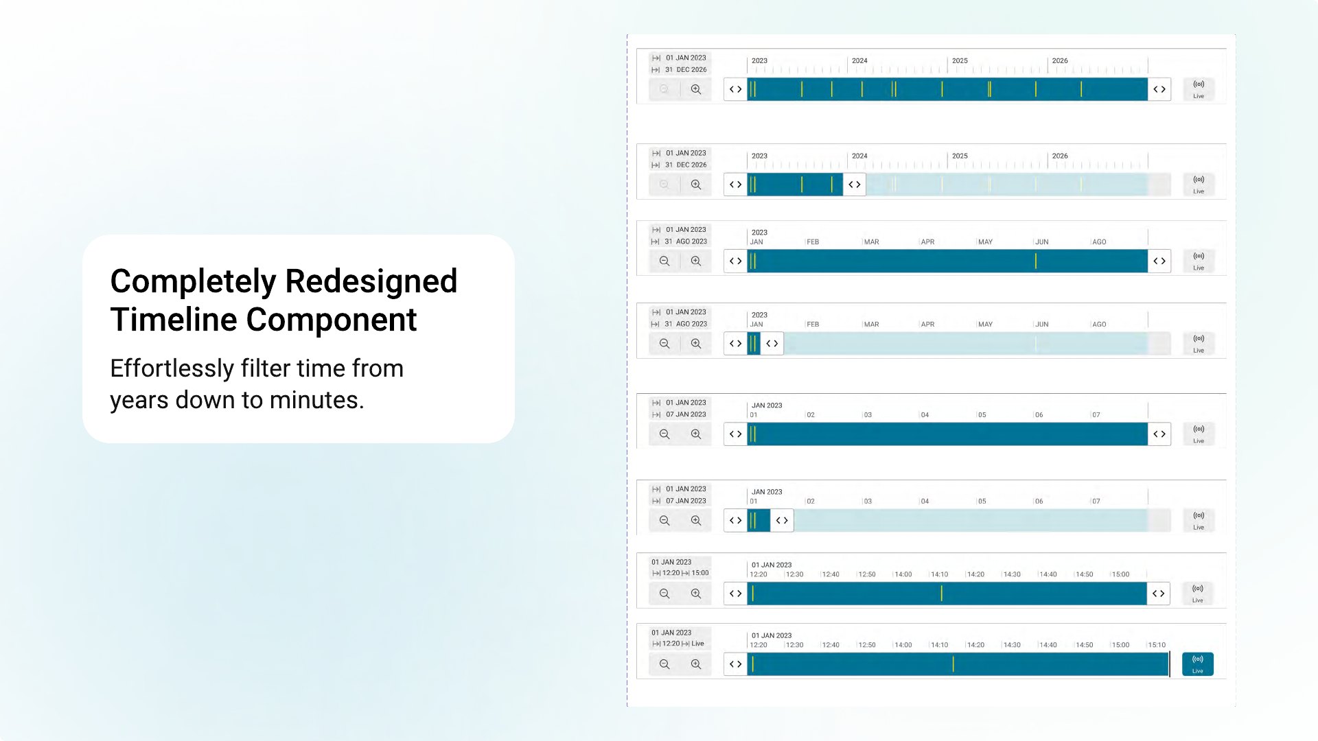
Monitoring
Displacement analysis
Impact
“It improved the maturing of the design, exploring different scenarios in advance of developing and testing… communication with SW developers turned out to be really smooth, with less stress and more common understanding.”
Giulio Telleschi — Project Manager
“A brand-new look & feel that solves lots of UI and usability issues we had previously… every stakeholder is looking forward to seeing the new UX concept live soon.”
Francesco Coppi — Director, Monitoring Radar Product Management
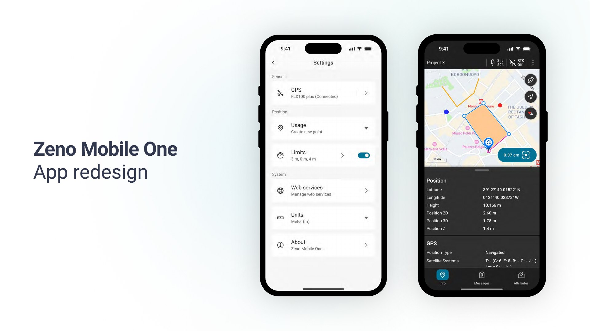
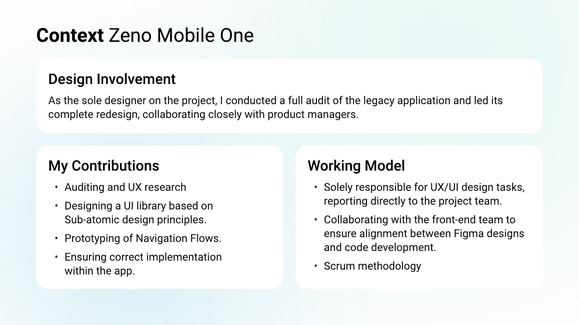
Zeno Mobile One
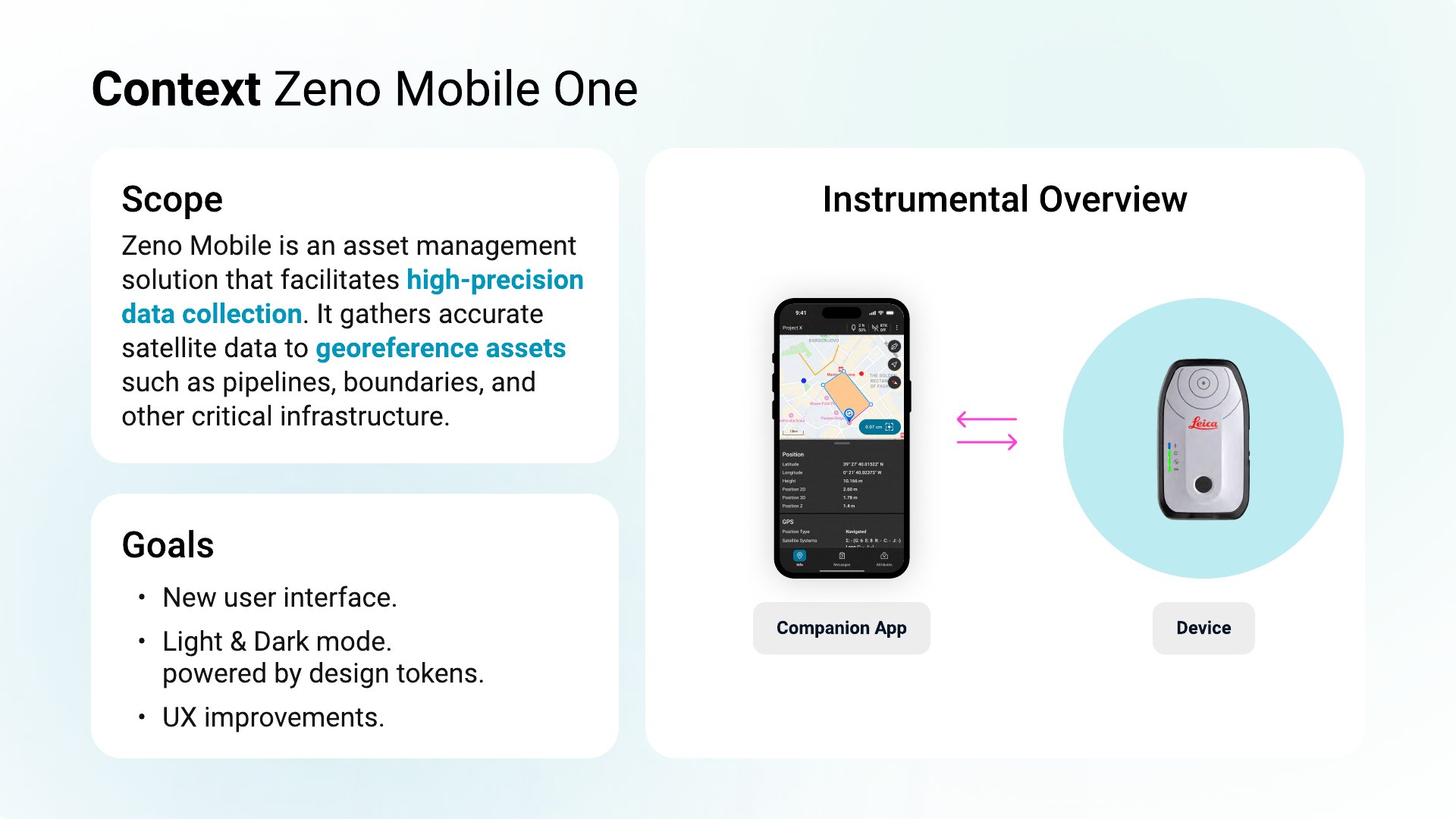
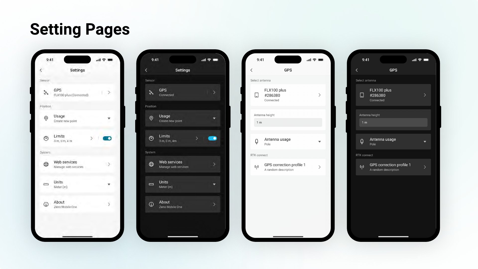
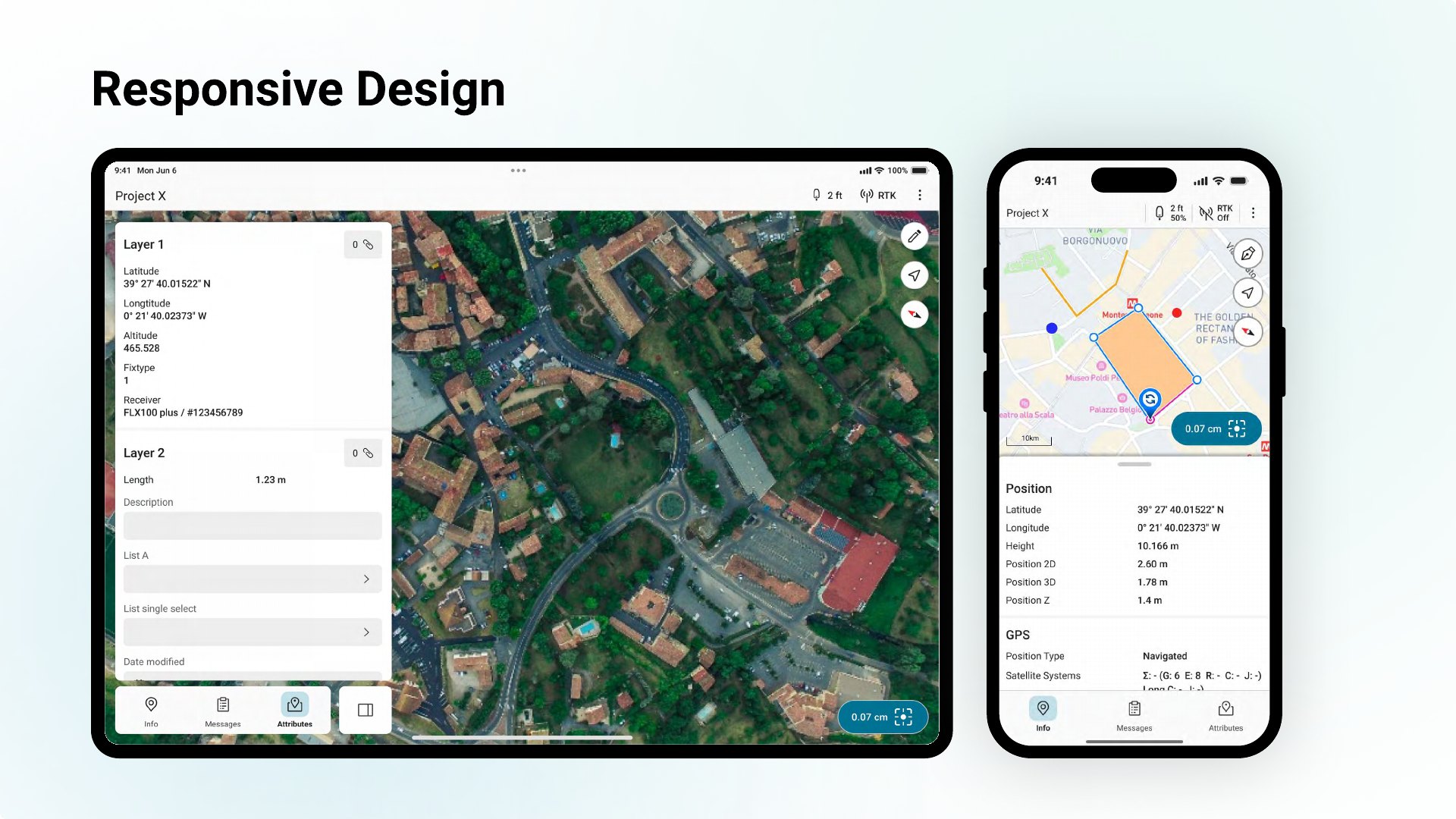
Field teams georeference critical infrastructure — pipelines, boundaries, assets — with survey-grade precision, but they were doing it through an outdated, inconsistent app with no underlying system and no support for variable outdoor lighting. Every screen drifted and development was slow. Zeno Mobile One is the ground-up, token-driven redesign that fixes this.
An asset-management solution that captures accurate satellite data to georeference assets in the field — it had to modernise and hold up in real outdoor conditions.
Sole designer. Full audit of the legacy app, then led the complete redesign with product managers and front-end (Scrum).
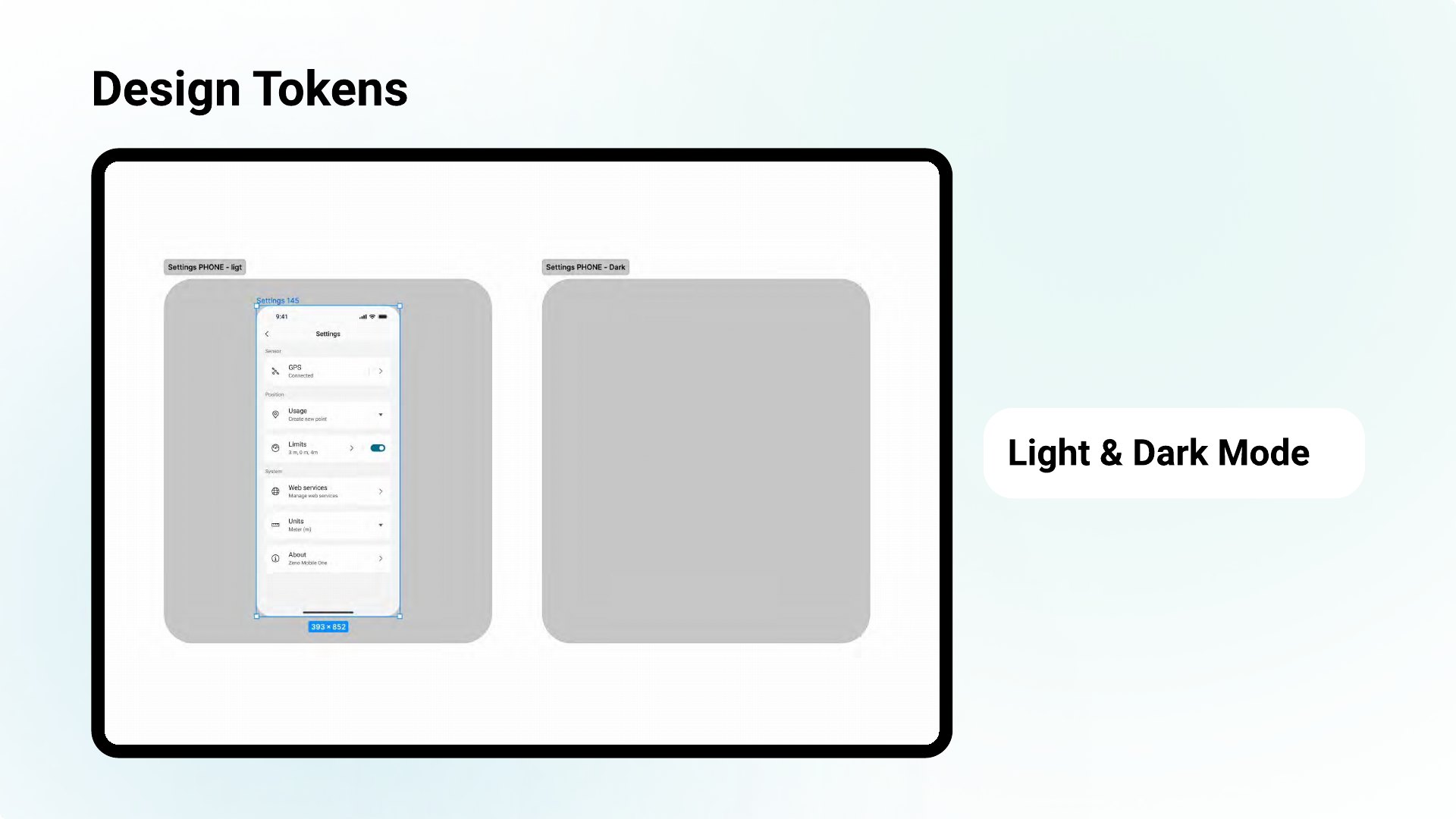
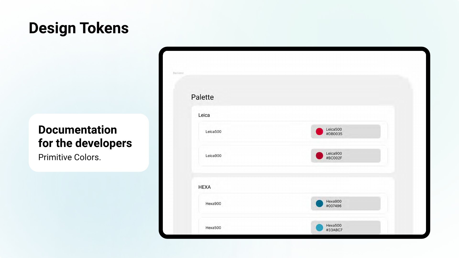
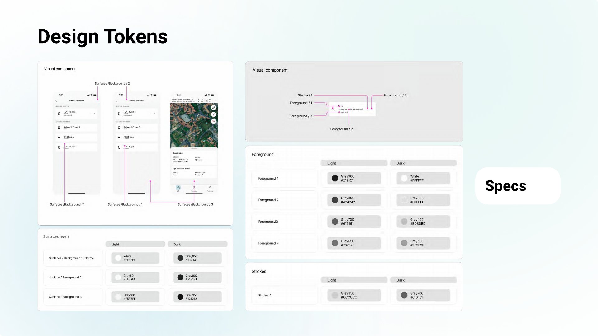
A token-driven UI library on sub-atomic design principles — consistent, themeable, fast to implement — aligned to the Pangea design system.
Interface & responsive design
Design tokens — light & dark
Impact
“Working with Stefano massively improved our workflow and results… since we have Stefano on board, this process really sped up.”
Cindy Teeven — Product Engineer
“He helped us revise the UI/UX to align it to Pangea and develop the missing parts… and transferred our ideas to the software development team in an effective way.”
Markus Speckle — Senior Software Engineer
UX/UI designer based in Zürich, working across hardware-related interfaces, embedded display experiences, mobile-first apps, web platforms and scalable design systems. Across roles in Austria and Switzerland, I have shaped complex digital products connected to physical devices, bringing software, hardware and real user workflows together in a clear, practical way. I design cross-platform with strong Figma expertise and a disciplined use of design tokens, supported by AI-assisted prototyping and rapid iteration.
Work experience
- Build and scale design systems — robust components and strategic design tokens for seamless UX across web and embedded platforms.
- Design intuitive, mobile-first interactions for sensor-driven and geospatial field products such as Zeno Mobile and MyMo, leading product designs to shape optimal UX and workflows.
- Create high-fidelity, vibe-coded prototypes to validate ideas quickly and generate documentation that supports faster development.
- Create and maintain an extensive custom icon library; drive design-system adoption and align design, product and engineering.
- Streamline UXOps as the main Figma Admin, improving governance and workflows across design operations.
- Designed across products — from touch embedded devices to Windows and web applications.
- Built and maintained the design system and design operations.
- Designed a cooking app that helps users find inspiration, share their creations and learn new techniques.
- Worked in an international, cross-disciplinary team to build the platform.
- Built the GPI design system and the visual design for GPI's software solutions.
- 2D Animator & Copywriter at Canadian Solar (Oct–Dec 2018).
- Graphic Designer, freelance, at Fiverr (2015–2017).